How to Create a Brand Style Guide for Your Business
One of the things I regularly do for my custom web design clients is develop a brand style guide for use on both their website and their marketing in general.
A cohesive set of brand guidelines helps to create a strong visual identity and professional presence for your brand.
This is super duper important, because your brand identity is the first thing a prospective customer will notice about your business—it quickly communicates who you are, what you do, and the feeling you’re able to create for your clients when you solve their particular “pain point” they’ve come to you for.
(Or… at least your branding should be doing that. 😅)
How to create brand guidelines for your business
Your website should follow the same branding guidelines you’ll be using in other parts of your business—social media, email marketing, customer/client communications and print marketing (or, whichever combination of these apply to you).
To keep everything intentionally branded and consistent, I recommend creating a brand style guide for use on both your website and your business in general.
This post contains affiliate links through which I may earn a commission if you choose to purchase, at no additional cost to you. As always, these are products or services I personally use & love!
Elements of a brand style guide
Depending on your business type and needs, you may have some different elements to consider for your own brand style guide, but here’s what I recommend including as a basic starting point for your brand guidelines:
Fonts
Font is one of the most important (and, surprisingly, most overlooked 🙀) elements of branding. The font(s) you choose to represent your brand should be thoughtfully selected to reflect your brand identity and how you’d like to be perceived by your clients.
We often describe fonts in terms of their general character: playful, modern, classic, rustic, feminine, fresh—the type of impression your brand seeks to make on your audience.
In general, it’s best to stick to just two fonts, three at the very most—for web design in particular we often recommend one serif and one sans-serif font.
This is a serif font (it has little lines on the ends of its characters).
And this is a sans-serif font (no little lines on the ends of its characters).
In general, serif fonts are easier to read in large blocks of text (think of a book—most are printed in serif fonts) and sans-serif fonts are crisper to read in headlines. Of course, these distinctions can be mixed and matched for stylistic effect. And, sans-serif tends to be a little more screen-friendly, so tends to be used more in web design.
Your branding can also incorporate script fonts designed to look like handwriting:
here’s an example script font!
Script fonts are useful for stylistic accents, but are typically not great options for large blocks of text or essential headlines, as they’re not as legible as other types of font.
Using script fonts on your Squarespace website
Some script fonts are available in the back-end of your Squarespace website, via your style editor (Design > Site Styles). It’s also possible to upload a custom font to your website with a little custom code.
Script fonts can be a bit tricky to get “right”—they’re intended to be more natural-looking, but can come across as fake if their characters don’t flow together properly like real handwriting.
Due to this challenge, there aren’t a ton of authentic-looking script fonts available to choose from in the back-end of Squarespace. If you’re not finding what you’re looking for there, Creative Market is a great option for purchasing quality script fonts, which can be added to your Squarespace website via custom CSS.
Where to customize font on your Squarespace website
Different font styles to customize and coordinate around your Squarespace website include:
site title (if you’re not using an image-based logo)
navigation links
headings
body font
link styling
blog fonts (title, body)
blog metadata (date, author, category, etc.)
footer font
image captions (if used)
e-commerce checkout process (if used)
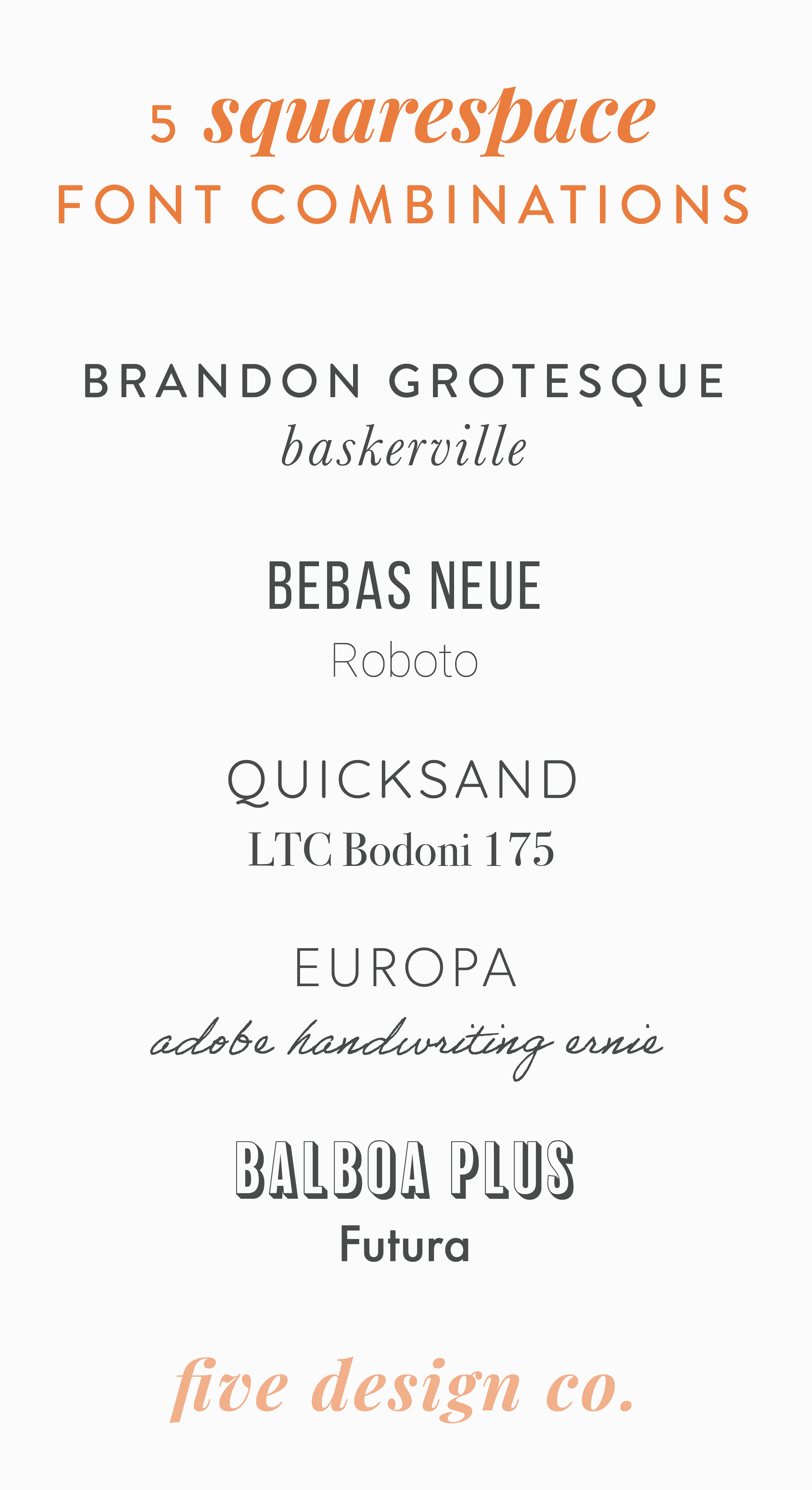
While the appropriate font for your particular business and website will vary depending on many factors (industry, brand voice and tone, target demographic, types of marketing materials you’ll be using), here are some of my favorite font combinations for Squarespace websites:
Colors
Your brand colors are some of the most recognizable aspects of your overall branding.
How many colors to incorporate in your branding is up to you, and varies depending on other aspects of your business and brand identity—for example, if your overall brand aesthetic is modern and sleek, you may want to stick to minimal use of color; but if your brand aesthetic is bright and cheerful, that could be enhanced with the use of multiple complementary brand colors.
When choosing your brand colors you’ll want to document and save your color codes: the specific alphanumerical codes that tell computers how to display the appropriate color.
Web design often works with Hex codes (six alphanumerical characters following a pound sign; for example, #000000 is black).
How to choose your brand color palette
Here are a few useful tools for developing your brand color palette:
ColorPick Eyedropper is a free Google Chrome extension that grabs the color code from anything you hover over in your web browser. It’s useful for pulling specific color codes off of imagery you’d like to complement or use as inspiration.
Here’s an example of pulling the color code from a specific area on our website’s homepage (in case we want to use this lovely shade of grey elsewhere 😉):
Coolors.co is a color palette generator that helps to compile potential color schemes. You can either browse new potential palettes based on certain established color codes you’d like to include (for example, if you have an existing color in your palette and would like to incorporate complementary colors), or you can browse a curated collection of color palettes compiled by other users.
For example, here are some of the top color schemes, as voted on by Coolors users:
Imagery
I definitely preach that it’s important to curate cohesive professional imagery for your website.
But in addition to the imagery you use throughout your website, establishing image guidelines for your brand as a whole helps to maintain consistency across other areas of your business as well—this extends to imagery that’s used in email marketing, social media, and print marketing materials.
While it’s awesome if you have the resources to commission a professional photoshoot for your brand (yay!), in reality, many small business owners and entrepreneurs (especially those just starting out) don’t quite have the resources to do that.
Another option is to use free (or paid) professional stock photography.
The best stock photography source for Squarespace websites
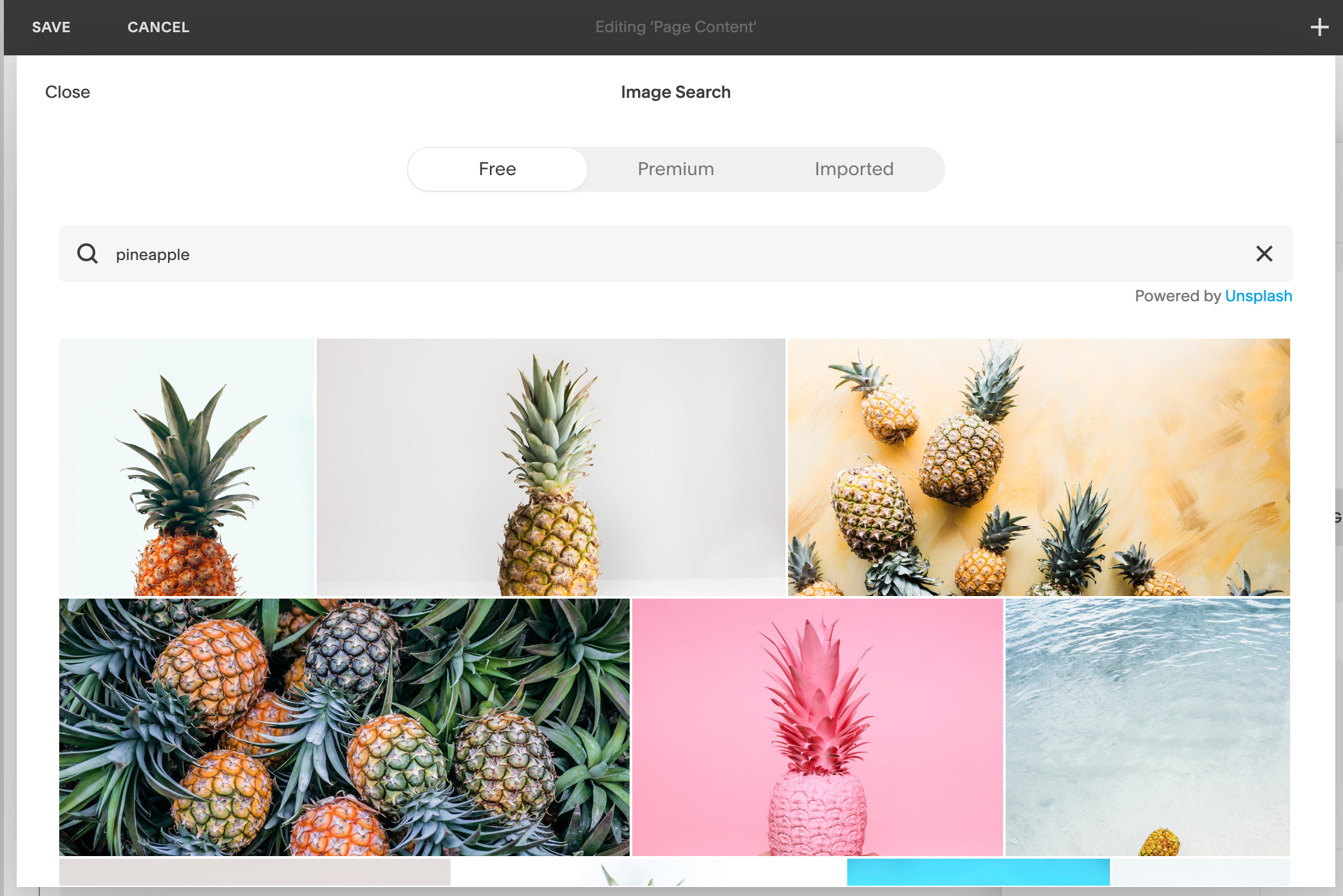
In particular, I like Unsplash, which offers an extensive collection of free, “non-stock-y” photography from independent artists around the world.
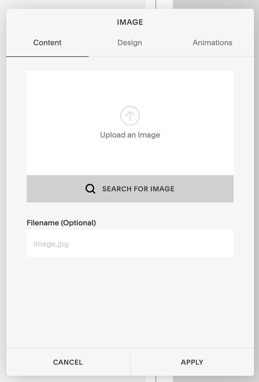
These images are available for use via a creative common license and Unsplash even has a seamless integration with Squarespace—in any image block, banner image or thumbnail image editor on your Squarespace website, simply click Search for Images and you’ll be able to search Unsplash’s full database directly from the back-end of your Squarespace website.
Brand voice
Establishing the tone of voice used in your branding can be one of the more complicated and lengthy parts of the branding process. It can certainly take some time to get comfortable with the “voice of your business” and consistently use that voice throughout your branding.
However, it’s still a good idea to think through the type of brand voice you’d like to cultivate, so you have some direction as you work on refining it.
How to establish a brand voice for your business
A few questions to work off of as a starting point in developing your brand voice:
Whose point of view are you speaking from? The business entity? The founder or CEO? The brand mascot? The whole team? (Here’s more about what to consider in making that choice!)
What style of communication does this voice have? Witty? Brief and direct? Friendly and conversational?
What type of vocabulary does this voice use? Formal, high-level industry jargon? Slang? Common keywords and phrases? Multi-lingual?
Who does the voice speak to? Does it speak directly to a single person (potential client), or to a broad audience in general?
Grammatical conventions
There are certain grammatical conventions that also help tie together your overall branding. For example, the capitalization of your business and product names.
This also includes your use of bold and italic font across your website and other brand materials—consistently used, these elements of written communication can begin to carry specific meaning or emphasis for your brand.
When developing your brand voice, be sure your use of grammatical conventions is consistent across your brand materials (including your website).
Applying your branding to your Squarespace website
Once you’ve created your own brand style guide, you can easily apply it to your Squarespace website via your site-wide style editor (Design > Site Styles)—that’s where you’ll update your website’s fonts, colors, image settings and more.
My favorite design software for branding your business
Canva is my favorite design software for creating the branded elements you’ll need for your business—everything from logos to Pinterest pins and social media graphics, to branded opt-in gift resources (like the Squarespace Website Checklist you see below!).
Though Canva offers a free plan you can use to create any of the branded elements you’ll need for your business (woohoo!), I usually recommend upgrading to the Canva Pro plan, which gives access to some other helpful tools and resources, including the ability to add all of your branding guidelines to a Brand Kit, for quick and easy use on all of your future business materials.
If you’d like to try it out, Canva offers a free 30-day trial of Canva Pro!
And, here’s more information on how to use Canva to created your business’ branding, as well as five important things I recommend branding for use in your business.
Squarespace Website Checklist
Create a professional website to grow your business & brand.
Get my free checklist for DIY-ing your dream Squarespace website:


